|
About the NACCS Logo |
About the NACCS Logo
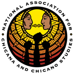
The NACCS logo was originally created for the 2000 National Conference held in Portland, Oregon, and is based on the conference theme: "Sabaduria, Lucha y Liberacion: Youth, Community & Culture en el Nuevo Sol". Even though it was meant for the conference itself, NACCS was currently seeking a logo and the leadership felt that the design truly embodied what the organization was all about.
The logo illustrates the male and female aspects of NACCS in an equal dialog and discussion, represented by the Mixtec speech scrolls. This dialog brings about a knowledge base that is disseminated by the membership of NACCS to the Chicano community; similar to the rays of light emanating from the sun itself. Finally, from that knowledge comes action, struggle and change, represented by the three fists. The fists are also recognition of the past struggles of our people throughout history, and a continued dedication to that struggle in the future.
The logo was created by Andres Antonio Barajas, a graphic artist originally from Portland, OR is currently residing in Los Angeles, CA. For further information on this logo and his work, his portfolio is available for view on his website at: andresbarajas.com.
Also within the banner is the abbreviation "NACCS". This design was originally created for the organization's letterhead and appeared in the 1988 conference program as "NACS". In 2000, Andres Barajas brought it back and updated it by including the extra "C".

